Alphabets
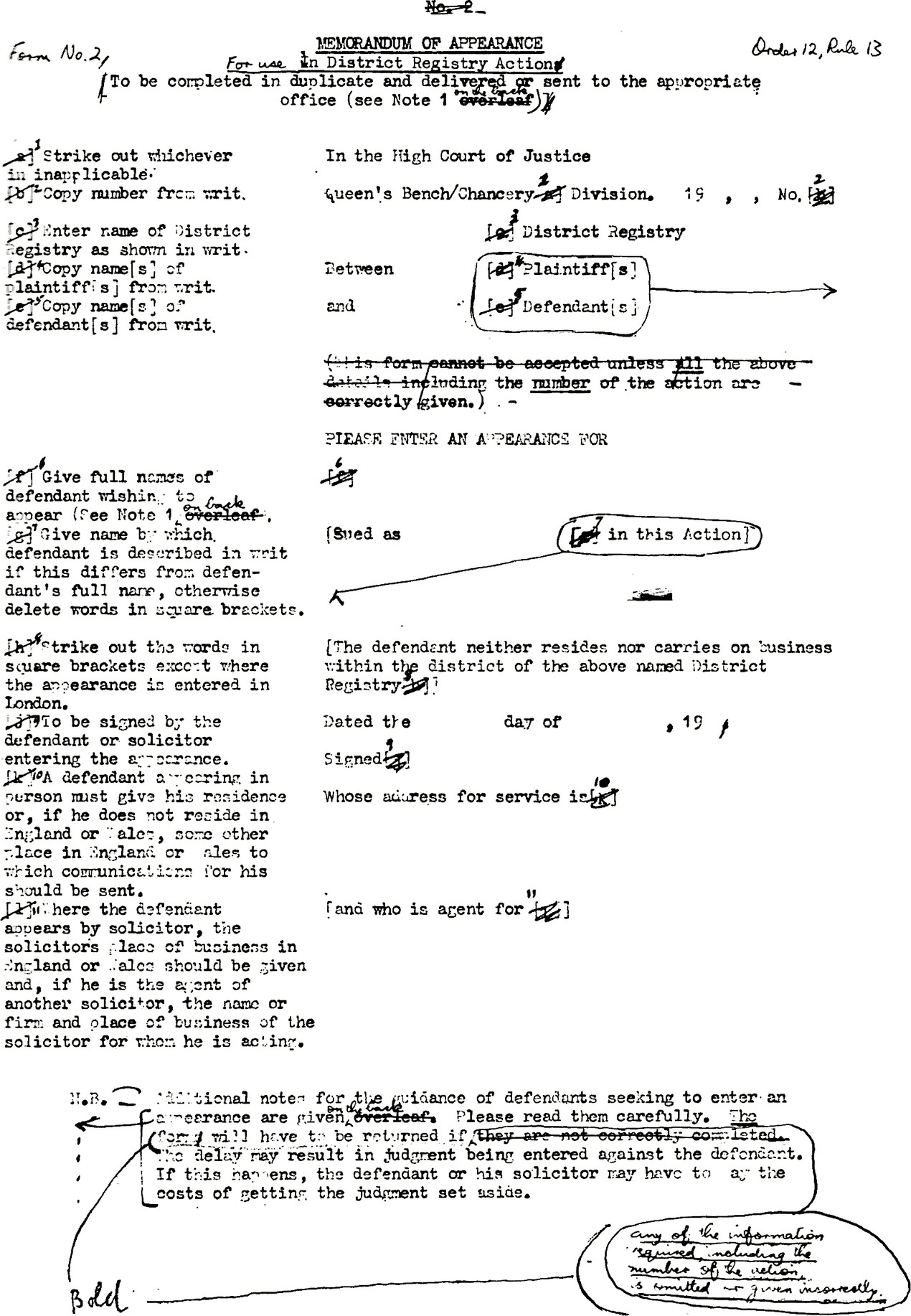
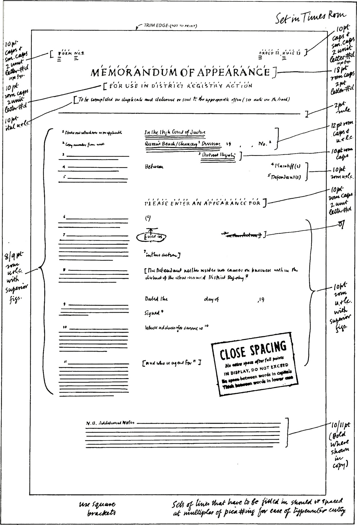
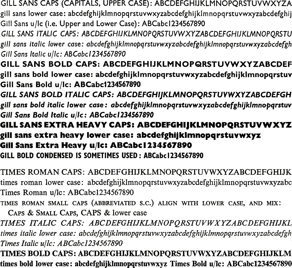
Each type face may offer a wide choice of alphabets, e.g. capitals and lower case. The use of different alphabets can help to provide the contrast necessary to avoid making the form look dull in appearance. A reasonable way of using the type available is to employ Roman for the bulk of the work, Italic for instructions, and Bold Face for emphasis—a better expedient than underlining.
Capitals should never appear in the middle of a line of lower case, nor should they be used for continuous text, though EVEN SMALL CAPITALS may be used judiciously for emphasis (letterspaced examples: SMALL CAPITALS SPACED THUS). Capitals and lower case are better for long captions and matter in text because they are easier to read than capitals in long lines. For two or more lines to be read together lower case is always better than capitals: compare pages 126 and 127.
Small capitals may be used for occasional emphasis or minor headings, and capitals reserved for the more important headings. However, capitals do not invariably dominate lower case. Typographers frequently reverse the traditional order by having a main heading in large capitals and lower case, and the small heading in capitals as on page 112. Much depends on the length of wording in the respective lines.
![Form with title MEMORANDUM OF APPEARANCE in person by post, (0.12.R.8A), E. 21C.
FORM FOR USE IN DISTRICT REGISTRIES.
This form to be sealed and filed in the District Registry or in the Central Office, as the case may be.
Price—Fourpence (excluding Purchase Tax).
In the High Court of Justice.
19: blank field.
No.: blank field.
Division: blank field.
District Registry: blank field.
Between, blank field, Plaintiff and, blank field, Defendant.
Enter an Appearance for (a), blank field, in this Action.
(a) Full names of the Defendant or Defendants appearing must be given.
[The said Defendant neither resides nor carries on business within the
district of the above-named District Registry (b)]
(b) These words are for use only where appearance is entered in London and should be deleted if appearance is entered in the District Registry.
Dated the, blank field, day of blank field, 19.
(Signed) blank field, of blank field.
whose address for service is (c), blank field, the said Defendant in person.
(c) The address for service must be the Defendant’s place of
residence within the jurisdiction or, if he has no such residence, some other place within the Jurisdiction (England & Wales).](https://d33wubrfki0l68.cloudfront.net/52dc8a1f4b4767eca3428f3b49b875edcc66251a/21fee/the-form-in-print/alphabets/1.jpg)


![Form No.2.
Price Eightpence (including Purchase Tax).
Order 12, Rule 8 (1).
MEMORANDUM OF APPEARANCE
FOR USE IN DISTRICT REGISTRY ACTION
To be completed in duplicate and delivered or sent to the appropriate office (see note 1 on the back).
IN THE HIGH COURT OF JUSTICE, blank field, 19, blank field, No.
(Copy year, letter and number from writ.)
QUEEN’S BENCH /CHANCERY DIVISION.
(Strike out whichever is inapplicable.).
blank field, DISTRICT REGISTRY.
(Enter name of District Registry as shown in writ.).
Between, blank field, Plaintiff(s), and, blank field, Defendant(s).
(Copy name(s) of plaintiff(s) from writ.)
(Copy name(s) of defendant(s) from writ.)
PLEASE ENTER AN APPEARANCE FOR, blank field.
(Give full name of defendant wishing to appear (See Note 2 on back).).
[sued as, blank field], in this Action.
(Give name by which defendant is described in writ if this differs from defendant’s full name, otherwise delete words in square brackets.).
[The defendant neither resides nor carries on business within the district of the above named District Registry. The name of the plaintiff, or his solicitor, and his address for service is].
(Strike out the words in square brackets if the appearance is entered in the District Registry.)
(Copy particulars from writ.)
Dated the, blank field, day of, blank field, 19, blank field.
Signed, blank field.
(To be signed by the defendant or solicitor entering the appearance.)
Whose address for service is, blank field.
(A defendant appearing in person must give his residence or, if he does not reside in England or Wales, some other place in England or Wales to which communications for
him should be sent.
Where the defendant appears by solicitor, the solicitor’s place of business in England or Wales should be given and, if be is the agent of another solicitor, the name or firm and place of business of the solicitor for whom he is acting.)
[and who is agent for, blank field, ].
N.B.—Additional notes for the guidance of defendants seeking to enter an appearance are given on
the back. Please read them carefully. The form may have to be returned if any of the information required is omitted or given incorrectly. The delay may result in the judgement being entered against the defendant.
If Judgement is entered the defendant or his solicitor may have to pay the costs of applying to set it aside.](https://d33wubrfki0l68.cloudfront.net/a83b6477cb0c7a5cbfa2301678c3e1ef05c8f814/613e8/the-form-in-print/alphabets/5.jpg)


