Use of colour
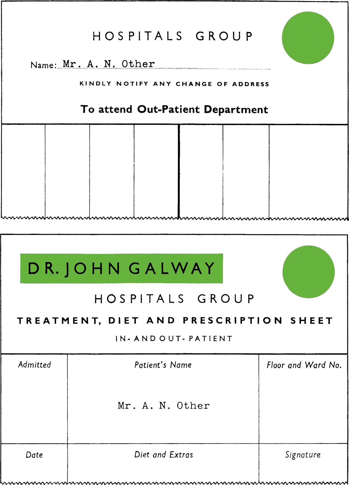
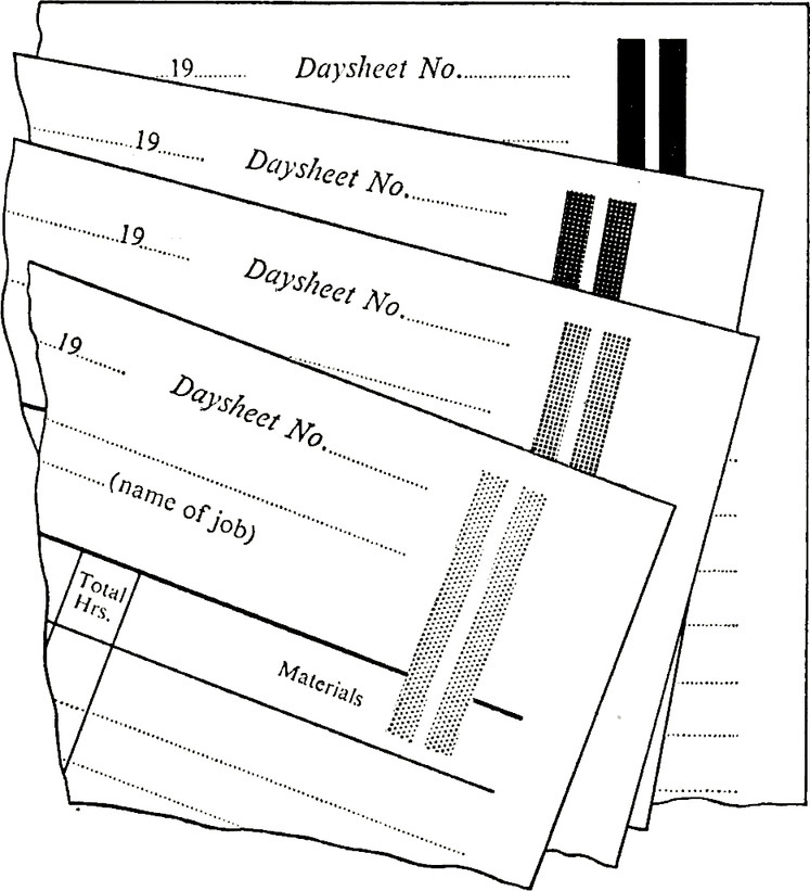
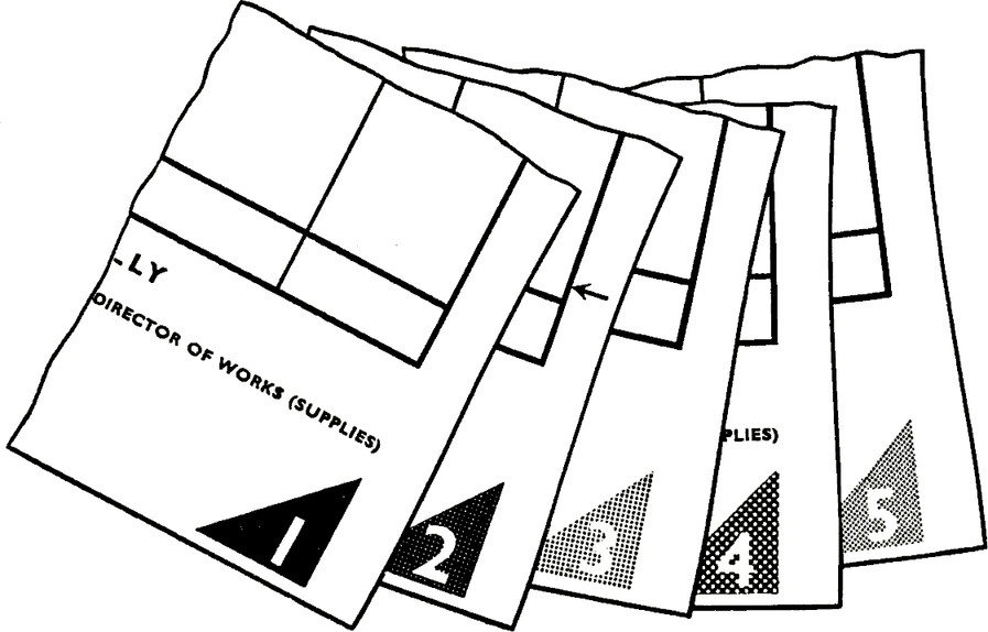
Coloured printing ink or coloured paper and card can help to distinguish documents or parts of documents and will facilitate operations such as sorting or selecting documents from a file, and assist identification of entries on a form.
There are, however, certain disadvantages, e.g.:
- Defective colour vision is more common than is generally recognised, especially
among men. It has been estimated that some 20% of the male population suffer from
colour blindness in some way or another.
If, however, a bold and distinctive symbol, number or letter can be associated with each colour used the risk of confusion will be reduced. - Some colours are irritating to the eyes and cause eyestrain; for this reason the Post Office prohibit packets or envelopes of a red colour.
Some colours which are individually restful to the eyes may, when paired with another colour, create dazzle, particularly when the colours are printed in alternating bands.
The contrast of coloured printing with the white paper on which it is printed can also cause eyestrain. - Tinted papers or cards may assist one office process, e.g. sorting, but add to the difficulties of another, e.g. reading.
- At the outset the range of colours chosen may be satisfactory, but when new classifications are developed it may be difficult to find suitable additional colours.
- Some colours tend to fade more quickly than others and where constancy of colour over a long period of time is important, advice should be obtained about the shades to avoid.
- Some colours are not suitable for certain types of photo-copying processes and the colour used will depend on the process being used. Whereas one colour may not be suitable for one process, the same colour may reproduce satisfactorily with another process which employs a different light source or sensitive material.
Coloured paper is slightly more expensive than plain and can be difficult to match. The use of coloured ink in typeset printing is, however, only slightly more expensive than black although it may cause delay in delivery. (This is so if only a corner or edge patch of colour is provided although the extra costs may be justified by advantages in sorting etc. operations.)
Normally therefore, the use of a coloured paper should be considered only when the use of a distinctive coloured ink on white paper will not achieve the particular purpose. Paper and cards of certain shades can be supplied from H.M. Stationery Office stocks, but some sizes and qualities may have to be ordered specially.
In view of the almost infinite variety of colours and tinted inks available, it is always necessary, when a particular match is required, to furnish the printer with a specimen of the desired colour.
The use of more than one colour on one page, counting black as a colour, necessarily increases the cost of production, as every additional colour requires a separate run through a press.
Additional ruled lines in colour can be added without extra cost by ‘machine pen ruling’, but this process is usually economical only for fairly small quantities.
Gummed coloured labels, with or without printing in contrasting ink, may be used to attach to documents for identification purposes; this avoids the extra machine operations involved in the production of an ordinary two-colour document.
Colours should be chosen after careful consideration of the conditions in which they are to be used. The light or illumination by which work is seen affects its colour.
Colour can also change in appearance when seen next to another. Different shades or tints of colours viewed one against the other may be easily identified, but may be hard to identify if viewed apart. Other points are:
- ‘Mixed’ colours such as brown, or different tints or shades of the same primary colour should be avoided as these are particularly bad for those with defective colour vision; black, blue, red and green are more satisfactory colours.
- Printing in pale colours between yellow and red is apt to try the eyes and make reading difficult; some lighting conditions may suggest that any pale printing ink should be avoided.
- Pale background shades of buff, yellow, blue and green provide a range of distinctive colours on which entries can be easily read.
Le Courier’s table of the order of legibility of colour combinations is as follows:
| Order of Legibility | Decoration | Background |
|---|---|---|
| 1 | Black | Yellow |
| 2 | Green | White |
| 3 | Red | White |
| 4 | Blue | White |
| 5 | White | Blue |
| 6 | Black | White |
| 7 | Yellow | Black |
| 8 | White | Red |
| 9 | White | Green |
| 10 | White | Black |
| 11 | Red | Yellow |
| 12 | Green | Red |
| 13 | Red | Green |
The full range of documents already in use should be examined as existing colour identification may preclude the choice of similar colours for other documents; colour codings throughout an area of operation should have the same significance; there should also be adequate contrasts between colour codes used in associated procedures.


