The layout and style of the form

The layout and style of the material included in a form merits careful consideration, e.g.:

  1. If the form is to be completed by a member of the public the dominant consideration will be to produce the right response from the person filling it up. This is not simply a question of the appropriateness of detail but of the psychological impact of the form as a whole. Various factors contribute to the citizen’s acceptance of the form and his collaboration in giving the required information. Some of these are: the apparent reasonableness of the demand for information, e.g. having regard to the requirements of the law or the value of vital statistical data; the timing of the issue of the form; the choice and form of the heading to the form; the location and content of notes and instructions etc.; the planning of entries on the form to provide a logical sequence of thought on the part of the person filling it up; the bringing together of related material etc.
  2. The flow of writing on the form should be continuous from left to right and from top to bottom and, within an allocated space, the normal left and right hand order of written matter should be followed.
  3. Entries may sometimes be arranged according to the subject or topic—splitting up the form into divisions or panels for this purpose.
  4. Subject to (1) above it may be practicable to arrange for entries to be made on the form in a manner and sequence which suits the use or the processing of the information obtained.
  5. When the entries on forms are to be made by any kind of machine the layout must be adapted to suit the particular requirements of the machine on which the form is to be completed. Each writing machine has a fixed number of characters per horizontal inch and a fixed number of lines per vertical inch. For some machines the positioning of the written matter, in relation to the horizontal and/or vertical edges of the paper used, is predetermined by the design of the machine. Always the mechanical requirements and limitations of the equipment to be used with the form must be known.

Panels or rectangular boxes with a caption in one corner may sometimes be used to good effect for individual entries such as ‘name’, ‘reference’ etc. Columnar arrangements are best used when many entries have a common description, e.g. ‘date’, ‘item’, ‘amount’; vertical lines are, however, not always needed with columnar arrangement.

Printed lines, horizontal or vertical, may be used in addition to panels and boxes, to separate items or groups of items. There are various types, ¢.g. heavy lines, thin lines, double thin lines, dotted lines and pen-ruled lines. Thick lines need to be used with care on copies which will be completed by carbon because if they are not in exact registration, the lines may obscure the carbonised entries. Dotted lines may be used on forms to be completed in manuscript instead of horizontal continuous lines (e.g. to indicate a writing line) they are easily made in type-setting machines and have a satisfactory appearance.

Pen-ruled lines are produced mechanically and, if specified, should run right across the form to facilitate production. Pen ruling has the advantage that, e.g. for accounting forms the lines can be in a distinctive colour and their thickness and spacing is easily controlled; very fine lines are well produced. Pen ruling is, however, more costly than printed lines; the only exception is when relatively small quantities are required and where the type matter does not extend to more than half the depth of the form, e.g. a ledger heading.

When used skilfully, panels, boxes and lines can help the identification of the entries and assist greatly in producing a suitable layout. But the indiscriminate introduction of boxes and lines can make the form both confusing and larger than is necessary. The following points should be kept in mind:

  1. Keep all lines as light as possible. Boxes do not always give emphasis to instructions; they sometimes tend to ‘take the entry out of’ the form.
  2. It is rarely necessary to print lines around the edges of the form.
  3. Discontinuous lines may make a simple form look complex and destroy the impression of a planned design. Continuity of lines simplifies type-setting.

Stippling may sometimes aid the identification of a column, but there may be technical difficulties and H.M. Stationery Office should be consulted. When an entry space must be obscured ‘printers’ ornaments’ provide an alternative.

The use of carbons, carbon coatings, or other means, to produce copies of forms or associated documents requires that all such forms or documents be designed together if optimum effectiveness of layout is to be achieved (see the section ‘Methods of making copies of the forms’ later in this book). When a ‘set’ of forms is designed for use with, e.g. carbons, it may happen that the most desirable layout for the top copy does not give the best arrangement of data on the undercopies. Some compromise may be necessary but the design of any copy which is to be completed by a member of the public should not suffer.

Various other devices assist the identification of entries and make completion of and subsequent reference to the form easier, e.g.:

  1. Captions or sections of the form may be numbered—but only if it is clear that this will serve a useful purpose. Where necessary arabic numerals should be used in preference to roman numerals as the former are quicker and easier to comprehend. A mixture of numbers and letters should be avoided, e.g. 1, a, b, c, 2, a, b, c, d, as this tends to cause confusion when referring to questions at the filling-in stage; entries should normally be numbered in sequence, avoiding if possible, sub-divisions such as 1(i) (ii) (iii) when 1, 2, 3, 4 etc. would adequately identify the entry.
  2. Symbols and marks help to indicate small adjacent instructions such as ‘delete items not required’; brackets may usefully indicate an entry area, e.g. for an address.
  3. An entry space for large sums of money or large numbers may be broken up into groups by the use of boxes, dotted lines etc.
  4. Boxes for ‘official use’ can be placed in an area which is convenient for office use and away from the centre of interest of other users; the lower half of the form or the back of the form may be suitable.

Various illustrations follow showing how the style and layout of a form can aid the identification of entries or improve the suitability of the form for the job.
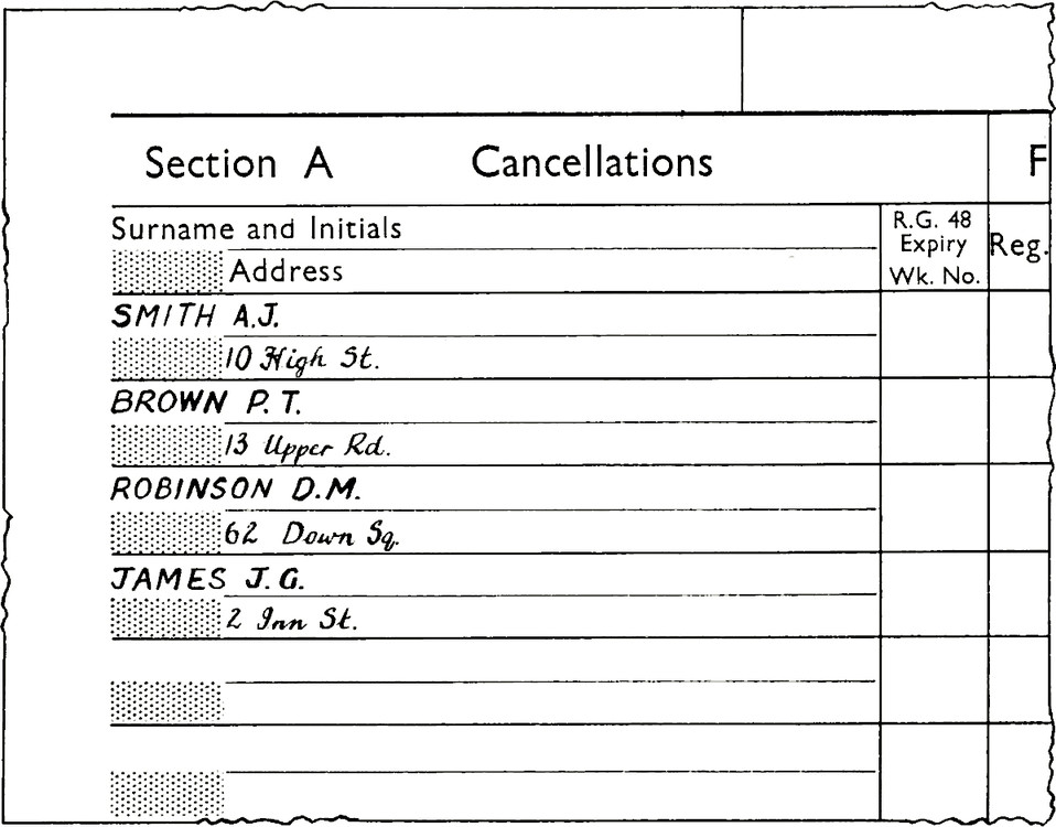
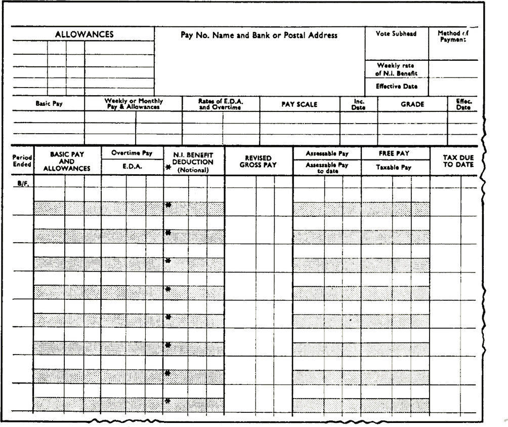
Table with title Section A Cancellations.
Column 1 subtitle Surname and Initials.
Column 2 subtitle Address.
Column 3 subtitle R.G. 48 Expiry Wk. No.
Row 1 reads SMITH A.J., 10 High St.
Row 2 reads BROWN P.T., 13 Upper Rd.
Row 3 reads ROBINSON D.M., 62 Down Sq.
Row 3 reads JAMES J.G., 2 Inn St.
Sets of similar entries with captions printed once only. Note the use of the shading to ensure that the address is indented, thereby enabling a name to be seen more easily in a long list
Use of stippling (a) to make a pattern to assist entry and reading (gross figures are entered in the stippled sections and the white spaces are for cumulative figures) and (b) to enable two sets of figures to be entered, distinctively, in one column
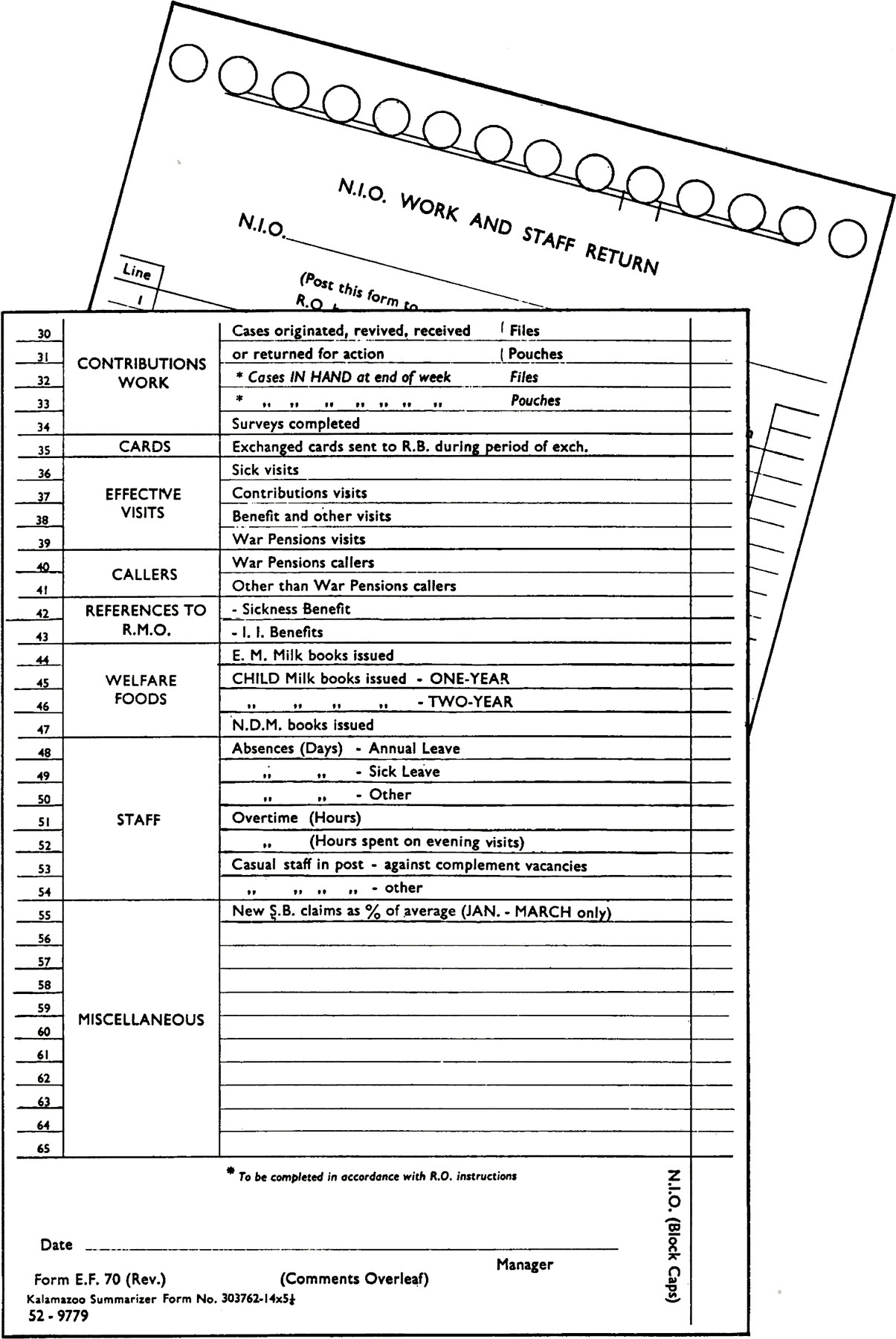
Two forms overlapped, on the left side of the forms they have matching line numbers which make it easier to compare the two.
Line numbers, and entries on the edge enable the form to be overlapped on a board for summarisation at Regional Offices. It is printed throughout in blue ink on white paper
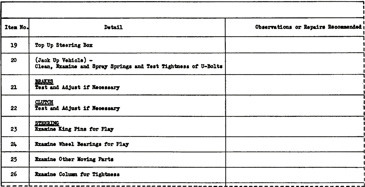
Table with 3 columns.
Column 1 has title Item No.
Column 2 has title Detail.
Column 3 has title Observations or Repairs Recommended.
Column 1 is has an incremeting number.
Column 3 has empty cells.
Column 2 has the following rows:
“Top Up Steering Box.
(Jack Up Vehicle),
Clean, Examine and Spray Springs and Test Tightness of U-Bolts.
BRAKES,
Test and Adjust if Necessary.
CLUTCH,
Test and Adjust if Necessary.
STEERING,
Examine King Pins for Play.
Examine Wheel Bearings for Play.
Examine Other Moving Parts.
Examine Column for Tightness.
A line down the middle of the form can ensure a tidy arrangement of entries. But if item 20 were rearranged in three short lines of type, the central upright line could be moved to the left, thus giving more space for entries
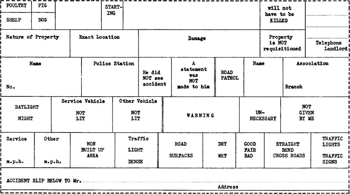
Table with lots of rows and columns with no uniform width, resembling a brick wall. Each cell has a title for example “Name, Police Station, Damage”
Disjointed and untidy appearance. Insufficient attention given to continuity in the vertical lines between entry spaces. The captions and action to be taken in completing the form are also not clear. Capitals should be used consistently (there are three errors in the lower example on [page 14](/deciding-requirements/collecting-assembling-and-analysing-relevant-information/))
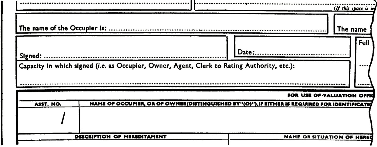
Form with fields, for example “The name of the Occupier is,Signed, Date”.
Each field has a dottled line and a thick border around them with little spacing.
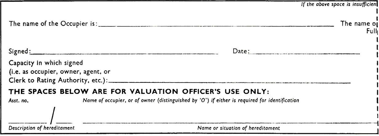
Some panel arrangements make the form look untidy and unnecessarily complex. Below is a suggested restyling.
Form with fields, for example “The name of the Occupier is,Signed, Date”.
Each field has a sngle line with large spacing around them, no borders.
Table with fields, for example “Date, Part No., Part Name”.
Each title is at the top left-hand corner with space to write the entry below.
Captions placed in the top left-hand corner facilitate typing and help to keep the appearance of the form simple and tidy. An exception is a position at the bottom of the panel which would make reference to names and numbers clearer, e.g. when a panel is placed at the top edge of a form to facilitate filing and indexing
Table with 5 columns and two rows.
Row 1 reads: “Type of Machine including Makers’ Name.
Size, including Jib Length, etc.
Additional Equipment.
Owner’s Serial Number.
Postal Address of Site or Yard at which Plant is now located.”
Row 2 reads: “EXAMPLE: Excavator, Ruston-Bucyrus.
10 (3/6 cu. yds.) 15 ft. Jib.
Shovel Skimmer.
9.
Factory under constructionfor Messrs. Smith Ltd., Bath Road, Kelston, near Bristol.”
Sample entry in one set of entry spaces instead of worded instruction for using the form
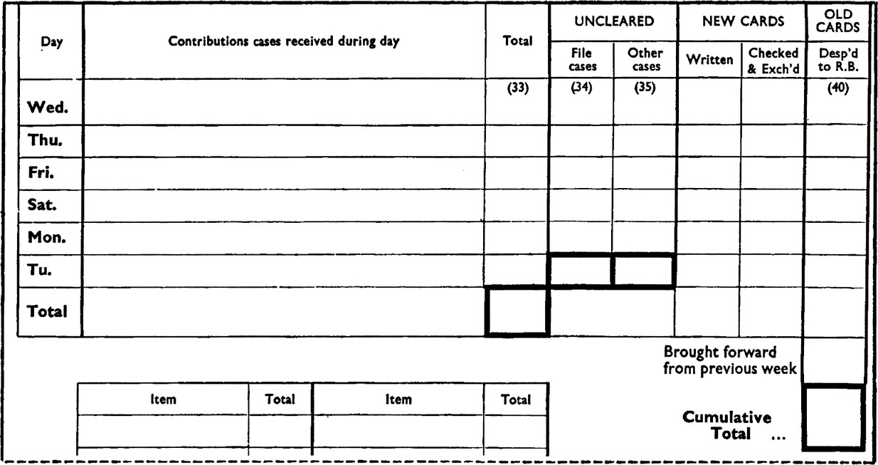
Form table with entries for each day of the week and an additional cumulative total row which has a thicker border than the other entry rows.
Thicker lined boxes to emphasise particular entries
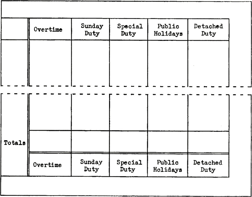
Table with 5 columns with titles “Overtime.
Sunday Duty.
Special Duty.
Public Holidays.
Detached Duty.”
A the bottom of the table the column titles are show again next to a totals title.
Captions placed in a second position at the foot of long columns to help the eye
Table with three columns.
Column 1 has title “Ms. Mrs. Miss.”.
Column 2 has title “Christian Names”.
Column 3 has title “Surname” with “Continuation” above it.
The printed word ‘Continuation’ distracts the eye from the surname entry and could have been placed elsewhere, away from the reference panel
Squared off area with drawn corners with (address area) label.
Warning in capitals surrounded by black filled stars.
Asteriks with Delete as necessary label.
Sign here with black filled finger pointing right.
Black filled circle with now, please turn overleaf.
Various aids to the completion of the form
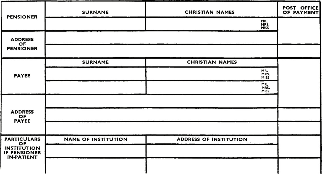
Form for pensioners includes Surname, Christian name, Payee, Address etc.
No spaces between black lines so is not clear what section belongs to what.
These heavy black lines have a tiring effect on the eyes and overshadow the captions because there is insufficient contrast. The substitution of some fine or dotted lines would help
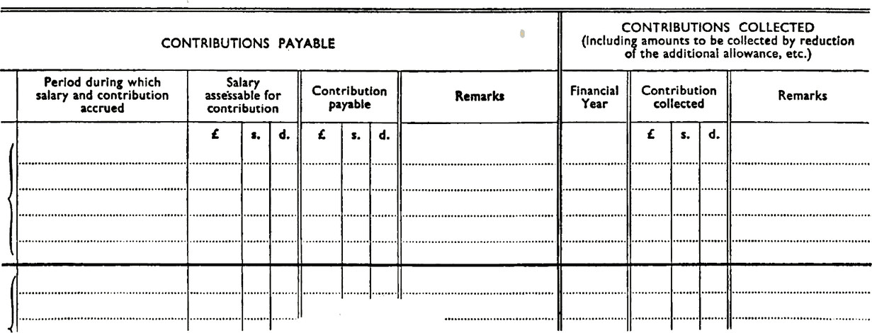
An example of the effective use of dotted lines for entries, with heavy lines to mark every fifth horizontal line, double thin vertical lines to divide columns, and double thick vertical lines to divide the main sections
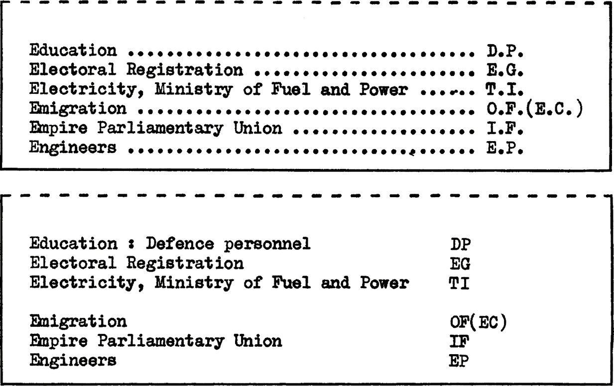
Two examples of the same description list which reads: “
Education : Defence personnel, DP.
Electoral Registration, EG.
Electricity, Ministry of Fuel and Power, TT.
Enigration, OF(EC).
Enpire Parliamentary Union, IF.
Engineers, EP.
First example connects the full word with it’s abbreviation using dotted lines.
Second example uses spacing to connect the two instead.”
A subject, name index, or contents list of this kind does not require rows of dotted lines to guide the eye from the first to the second column. A space left after every third line avoids the distracting effect of dots and serves as a more effective guide for the eye. When there is insufficient room to provide the blank space, a line drawn after every third line of print will serve the same purpose
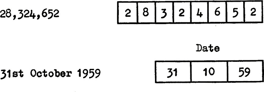
Two examples.
First example has number: 28,324,652 then it is shown with each digit in it’s own box cell.
Second example has date: 31st October 1959 then it is shown with each section in Date table with date 31 in first cell, month 10 in second cell, 59 year in last cell.
Boxes for large numbers, dates etc. make reading and reference easier
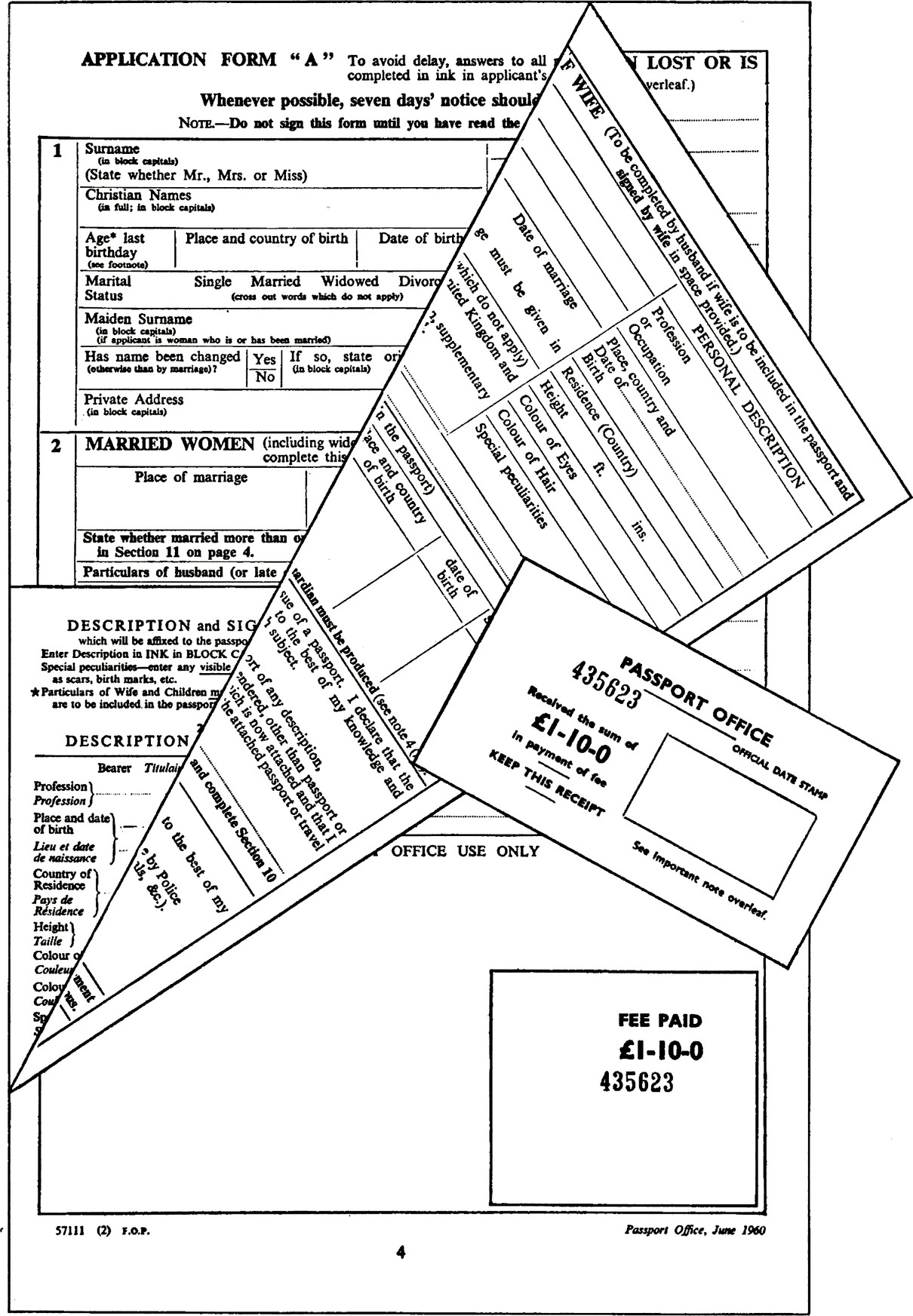
Two receipts have the same sum of £1-10-0 for comparison.
When a charge for each service remains constant, serially numbered sets of receipts can be provided for each denomination. This avoids detailed recording and provides a simple analysis