Spacing allowances for entries
Adequate space must be provided to facilitate easy completion of the entries; spaces which require members of the public to write smaller than they normally do can be irritating and also slow down completion of the form.
When designing certain internal forms, e.g. stores ledger sheets, sufficient space must be provided to facilitate easy completion of entries without unnatural cramping of handwriting.
The best guide to the space required for each entry is by reference to the actual entries made on existing or similar forms.
The spacing provided on a new form should be tested by making a typical range of specimen entries with any of the writing instruments likely to be used for completing the form, allowing for variations in the sizes of handwriting, and differences in the spacing required for the different kinds of typewriter characters on machines.
The spacing should cater for the normal entry and not the exceptional; where there is a substantial variation in the amount of space taken up by certain entries it may be worth providing two sizes of form, or extension sheets for particular data.
The size of the entry space or column should be determined by the size of the entry to be made and not by the size of the caption. When the caption is long or difficult to fit into the width of a column, the following methods may be useful:
- Abbreviating the caption consistent with clarity.
- Coding or numbering columns and entry spaces and printing the headings or captions in another part of the form.
- Dividing long words over two lines.
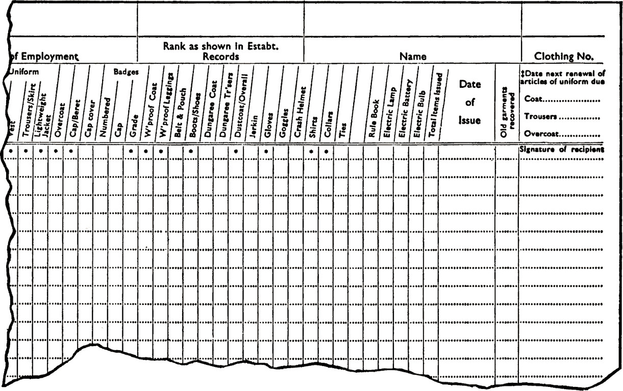
- Printing sloping or vertical headings; vertical headings are suitable for short captions recognisable at a glance.
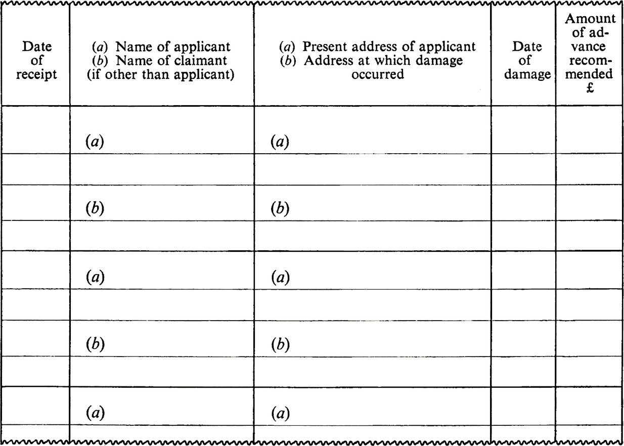
- Using one wide column for two related entries written one above the other.
- Printing the headings horizontally in ‘extensions’ to the columns.
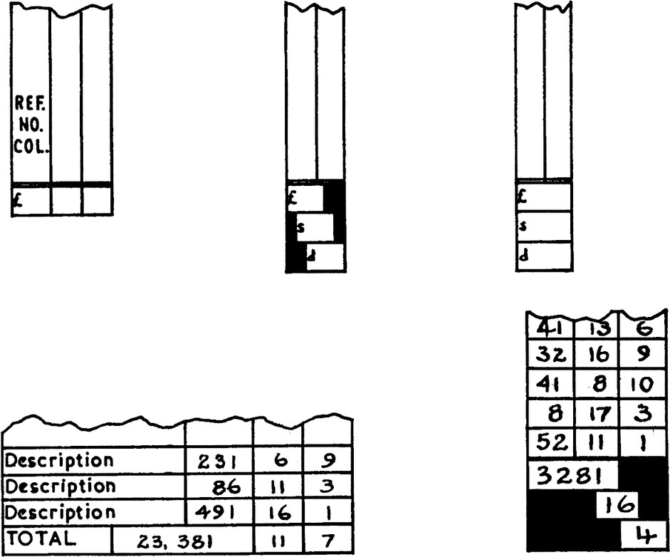
When items are being totalled at the foot of the column, the space required for the ‘total’ may exceed the width of the column, e.g. items in s. d. which give a total in £ s.d. Extra space for the ‘total’ entry can then be made in two ways:
- By extending the space for the ‘total’ under a ‘description’ column immediately preceding the column for the figure entries.
- By staggering £ s. d. totals at the foot of the column.


